Good teams are made of people and things. I build them —
as solid as necessary, as fluid as possible.
My specialty: bringing people together through artifacts.
A shooting schedule gets thirty people through a day, a
report puts business and IT at one table — and this page
turns a CV into a conversation. Screenplays and websites at
the start, SQL, data models and my own Power BI visual
today — those are only the ends of the journey. The core
has stayed the same: understanding what needs to happen
between people, and building the thing that makes it
happen.
Two part-time roles, one craft: data models that business
departments actually use.
Data Warehouse Specialist
Supernova Groupsince
Part-time, Graz (hybrid). Planning, building and running a
data warehouse (Power BI / Fabric, SQL, Python).
Data Analyst
Neurothsince
Part-time, Graz. Building data models and reports from a
marketing perspective (Power BI / Fabric, SQL, Python) —
and translating between business and technology.
How does a systems analyst end up planning the company’s data
model? Station by station.
Systems Analyst — Product Engineering & Product Management
XAL GmbH, Graz (lighting industry) –
Led the Power BI committee (2022/23): planned a new
data-warehouse architecture on the Microsoft stack — two ERP
systems, PIM and SharePoint as sources; models and reports in
Excel and Power BI (SQL, SSAS); coordination of DWH
changes via Azure DevOps.
Project lead for the introduction of the new EU energy
labels (2020–2022).
Product owner of the in-house PIM (2016–2023;
Django/Python/PostgreSQL; backend of the product website
with more than 10,000 products).
Built and rolled out many small tools — Excel, Power BI,
Power Automate, Power Apps, SharePoint, SmartSheet; and
analogue: pin boards, cards, flip charts.
Organisational development of new roles and processes in
product development (2016–2018).
A year working for myself — and the fastest school I ever attended.
Founder
Forgetit.io –
Built a time-management app. An intense year in the start-up
community — lean startup, agile, Kickstarter, social media.
Grew out of the Gründungsgarage at the University of Graz.
Project management first, then seven years at the University of
Graz — business studies, sociology, start-up garage — and finally
teaching others.
University
University of Graz2008 – 2015
Business studies, sociology, start-up garage.
Getting in came first: the university entrance exam
2008 – 2010, taken without a school-leaving
certificate. Then three semesters of business studies
(2010 – 2011, 45 ECTS) and the move to sociology
(2011 – 2014, exams worth 168 ECTS, no final
thesis). Finally the Gründungsgarage at the Institute of
Corporate Leadership and Entrepreneurship (2014 – 2015),
where the iOS app “Forget it!” took shape —
and led to founding Forgetit.io in 2015.
Generalist Project Manager
Activity2006 – 2007
Two-semester programme of 1,175 hours.
Systemic project management, NLP, plus basics in accounting,
controlling, labour law and coaching.
Before data came film: five years in production, unit management and
art department — project management under real-time conditions.
Filmography on Crew United
Production & Unit Management
Unit management means the shooting schedule is your
product. Who stands where and when, whether catering
arrives before the lunch scene, what happens when the lead
is stuck in traffic — and the deadline is called wrap,
every single evening. On the ORF documentaries I also
planned whole productions;
“Zwischen-Pass” was my own film, from
script to cut.
“Erlebnis Österreich: Der Schöckel” — documentary, ORF; RAN-Film09 – 12/2007
Director, Writer & Editor
“Zwischen-Pass” — my own short film06 – 09/2006
Assistant Unit Manager
“Oneline Life: Play Hard Go Pro” — documentary
Set Unit Manager & Art Department
“Jenseits” — feature film06 – 07/2005
Assistant Unit Manager
“Shiver: Stehst Du still” — music video
Assistant Unit Manager
“Wie Schnee hinter Glas” — short film
Art Department & Props
Started as an intern in interior props, at Bayerischer
Rundfunk. The art department is the craft behind the
picture: every object in the frame was put there by
someone. You learn lists, logistics and an eye for what
makes a scene believable. In the model only a quarter of
these hours count as project management — carrying props
is craft, not coordination.
Set Props
“Oben Ohne” — TV series, ORF; Star*Film
Set Props
“Novotny & Maroudi” — TV series, ORF08 – 09/2005
Set Decorator
“Heile Welt” — short film
Art-Department Internship, then Set Props
“8x45: Bis in den Tod” — TV series, ORF01 – 03/2005
Props Assistant (internship)
“In einem anderen Leben” — TV movie, BR12/2003 – 01/2004
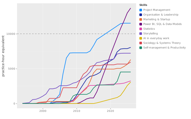
The same skills, calculated rather than claimed: an hour of
learning counts as two hours of practice. Exactly two curves
cross the line at 10,000 — the two with five stars.
Drawn with
ggpbi.
Project Management
Learned on film sets, where the schedule is the product and wrap is a daily deadline: thirty people, one plan, and when the weather turns, the whole day turns with it. Do that for a few years and you can manage projects before you ever use the word.
The theory came in 2006 — two semesters of systemic project management at Activity, IPMA Level D; the course also led to radical constructivism and, via Gareis, to business studies. Then Scrum at the startup, most recently the EU energy-label rollout at XAL: one project across the entire company.
Business studies left a gap: between what the textbook says and what actually happens inside a company. The textbook runs to a thousand pages, and the gap isn’t in there. Mintzberg closed it — he describes management the way it looks when you watch it.
The practice came at XAL: organisational development in product development, product owner of the in-house PIM, the Power BI committee, certified apprenticeship trainer. Current trail: complexity science and the edge of chaos — how much order a company needs, and how much movement.
The fastest school of marketing: at the Gründungsgarage we designed an app nobody had asked for — when nobody buys, no theory will save you. The app became Forgetit, and Forgetit became two years of running a startup: lean startup, pitching, Kickstarter, social media.
Today I sit on the other side of the table: at Neuroth I build data models from the marketing perspective — the same questions, answered with data instead of gut feeling. This spring the theory caught up: Sharp’s “How Brands Grow”, Binet & Field.
Daily since 2016: star schemas, DAX, SSAS, Fabric — eight years of XAL, now Neuroth and Supernova, plus the Python backend of a product website with more than 10,000 products. The point of it all: data models that make the connections visible.
Books barely cover this field; what I know comes from doing it, and from the web — above all Guy in a Cube. One book stands out: Wilkinson’s “The Grammar of Graphics”. It became ggpbi, my own Power BI visual.
Almost all of it from university: the lectures, the exercise classes that went with them, later whatever the job calls for. The textbook is still on the shelf — Bamberg, Baur and Krapp, read in 2010, the business-studies year.
It’s a field where I know pretty precisely where my limits are — and I prefer that to a field where I don’t. Kahneman and Silver came much later, as context rather than foundation.
The screenwriting books came before the films, not with them: Field, McKee, Aristotle, Mamet, Freud’s “Jokes” — all before 2003. First read, then shot: five years of film were the practice.
The thickest book in the column isn’t about writing at all — in 1,250 pages of “War and Peace”, Tolstoy runs a hundred characters without losing one. Today the craft builds reports that someone understands, and at best remembers. A dashboard is a story too, just shorter.
The youngest field and the only one without a single book — no book could keep up. What I know comes from daily use: at work, at home, everywhere.
The learning happens on YouTube, in a pattern noticeably different from Power BI: there, one channel with eighty-three videos; here, many channels with two or three each. That’s what learning looks like before a field settles — you don’t subscribe, you observe.
It started with a door-closer: in thirteen pages Latour describes how a piece of metal takes over a doorman’s job — after that, sociology stopped being a subject and became a lens. The trail before it: Chinese medicine and its thinking without cause and effect, then constructivism via the project-management course.
Three years of sociology at university, no degree — the lens stayed. Becker taught me how to write, Latour how to follow networks; complexity science is the current trail. Grown from the books, so it carries no stars: the shelf is the rating.
Eight years of secondary school in a single year, alongside a job — the university entrance exam only works with a system, and “Getting Things Done” provided it. The second time was the startup: too little time for too much.
At the end of the XAL years came the Stoics, via audiobooks — Marcus Aurelius sits at the very top of my ranking, right next to Tolstoy. Two thousand years old, and closer to GTD than either side would admit. Also grown from the books — no stars.
Deep into AI since 2023, professionally and privately —
from prompting to the question of what the models are
doing to our work.
Systems Theory
Gareis’ “Happy Projects!” kicked off my interest in systems
theory. It was also the decisive reason to enrol in business
studies — and later to switch to sociology.
“The Web That Has No Weaver” showed me a lot about the
holistic thinking of Asian theories. TCM and feng shui work
fine without our cause-and-effect thinking.
Making Data Visible
My CV as a data model: timeline, competence curves, an
interest budget — computed instead of claimed.
I am not what I read. But what someone reads says a lot about them.
So I tried to reconstruct which books shaped me — print and audio, going back to school days. And then asked the question you can only ask once they all lie side by side: which book gave the most for its pages?
Sociology
Philosophy & Stoicism
Management
Film & screenwriting
Systems thinking
Psychology
Data & technology
Literature & biography
Thick to thin from left to right, quiet to powerful from bottom
to top, colour is the genre. Top right are the
stars — big effect, few pages.
Drawn with
ggpbi.
The same books, with the year read across instead of the page
count: screenwriting before 2003, constructivism around 2010,
the Stoics after 2020.
Top right
Big effect from few pages — 27 books under 379 pages, rated "formative" or higher.
Mixing Humans and Nonhumans Together: The Sociology of a Door-Closer Bruno Latour13
Doing Gender Candace West, Don H. Zimmerman27
The Long and the Short of It Les Binet, Peter Field80
Die Kürze des Lebens Lucius Annaeus Seneca90
Poetik Aristoteles110
Die Kunst der Filmregie David Mamet112
Anleitung zum Unglücklichsein Paul Watzlawick140
Rebalancing Society Henry Mintzberg150
Wie wir uns erfinden. Eine Autobiographie des radikalen Konstruktivismus Heinz von Foerster, Ernst von Glasersfeld170
Wahrheit ist die Erfindung eines Lügners Heinz von Foerster, Bernhard Pörksen170
Bedtime Stories for Managers Henry Mintzberg200
Die Kunst des professionellen Schreibens Howard S. Becker200
Das Verschwinden der Kindheit Neil Postman200
The Obstacle Is the Way Ryan Holiday210
How Brands Grow Byron Sharp230
Selbstbetrachtungen Marc Aurel250
Scrum: The Art of Doing Twice the Work in Half the Time Jeff Sutherland, J. J. Sutherland250
Getting Things Done David Allen267
Stillness Is the Key Ryan Holiday270
Drehbuchschreiben Syd Field280
Der Baum der Erkenntnis Humberto R. Maturana, Francisco J. Varela280
Der Witz und seine Beziehung zum Unbewußten Sigmund Freud280
Die große Verführung Robert Levine300
Reassembling the Social Bruno Latour300
Managing Henry Mintzberg304
The Mind Map Book Tony Buzan, Barry Buzan320
The Lean Startup Eric Ries340
Top left
The same effect, considerably more time.
Krieg und Frieden Leo Tolstoi1250
Steve Jobs Walter Isaacson656
Die Traumdeutung Sigmund Freud600
Happy Projects! Roland Gareis590
Das große Buch der chinesischen Medizin Ted J. Kaptchuk550
Thinking, Fast and Slow Daniel Kahneman500
Story Robert McKee466
Scale Geoffrey West448
Mintzberg on Management Henry Mintzberg420
Learn You a Haskell for Great Good! Miran Lipovača400
Always theory-driven: it began with American screenwriting theory, built on Aristotle’s Poetics — then systems theory and Asian classics, then actor-network theory, Mintzberg, lately complexity science. The mix fits wherever people are connected through artifacts. Here’s the journey — skipping allowed.
Storytelling
The screenwriting books came before the films, not with them: Field, McKee, Aristotle, Mamet, Freud's "Jokes" — all before my military service in 2003. First read, then shot. Five years of film were the practice.
The thickest book in this column isn't about writing at all: "War and Peace". In 1,250 pages Tolstoy shows how to run a hundred characters without losing a single one.
Today the craft serves something else: building a report that someone understands — and, at best, remembers. A dashboard is a story too, just shorter.
Stations
Systems Analyst | Product Engineering & Product Management, Founder — Forgetit.io, Sociology studies, Gründungsgarage — Designing an iOS App (“Forget it!”), University Entrance Qualification, Ferdinandeum Music Middle School, BORG Hasnerplatz — Computer Science Branch
Books
Krieg und Frieden, Story, Poetik, Die Kunst der Filmregie, Die Traumdeutung, Der Witz und seine Beziehung zum Unbewußten, Drehbuchschreiben, Roman eines Schicksallosen, Die Kunst des professionellen Schreibens, Kinder brauchen Märchen, David Lynch und seine Filme, Stanley Kubrick und seine Filme, Quentin Tarantino, Mein letzter Seufzer, Bedtime Stories for Managers, Filme schreiben, Grundkurs Filmanalyse, Joel & Ethan Coen, Vom dreifachen Gebrauch des Messers, The Leader's Guide to Storytelling, Lead with a Story, Parenting with a Story, Archetypen, Zhang Yimou und Wong Kar-Wai, The Leader's Guide to Radical Management
My first project wasn't called a project. On a film set it's called the call sheet: thirty people, one shooting schedule, and when the weather turns, the whole day turns with it. Do that for a few years and you can manage projects before you ever use the word.
The theory came in 2006: two semesters of systemic project management at Activity, IPMA Level D. The course gave me more than the certificate — it led me to radical constructivism, and Gareis' "Happy Projects!" is why I enrolled in business studies. Then Scrum at the startup, and most recently the EU energy-label rollout at XAL — one project cutting across the entire company.
Stations
Systems Analyst | Product Engineering & Product Management, Generalist Project Manager, Founder — Forgetit.io, Director, Writer & Editor — “Zwischen-Pass” (short film), Production Assistant — “Menschen & Mächte: Erzherzog Johann” (documentary, ORF), Production Assistant — “Erlebnis Österreich: Der Schöckel” (documentary, ORF), Art Department Internship — “8x45: Bis in den Tod” (TV series, ORF), Military Service — Paramedic, Props Assistant — “In einem anderen Leben” (TV movie, BR), Assistant Unit Manager — “Wie Schnee hinter Glas” (short film), Assistant Unit Manager — “Shiver: Stehst Du still” (music video), Set Unit Manager & Art Department — “Jenseits” (feature film), Standby Props — “Novotny & Maroudi” (TV series, ORF), Assistant Unit Manager — “Oneline Life: Play Hard Go Pro” (documentary), Professional Scrum Master I, Standby Props — “8x45: Bis in den Tod” (TV series, ORF), Set Decorator — “Heile Welt” (short film), Standby Props — “Oben Ohne” (TV series, ORF), Production Support
Books
Projektmanagement, Scrum: The Art of Doing Twice the Work in Half the Time, Happy Projects!, The Lean Startup
Most of it I learned during the Studienberechtigungsprüfung, Austria's university entrance exam: eight years of secondary school in a single year, alongside a job. That only works with a system — mine came out of "Getting Things Done" back then.
The second time was the startup years, for the same reason: too little time for too much. And at the end of the XAL years came the Stoics, through the audiobooks — Marcus Aurelius' "Meditations" sits at the very top of my ranking, right next to Tolstoy. Two thousand years old, and closer to GTD than either side would admit.
Stations
University Entrance Qualification, Founder — Forgetit.io, Gründungsgarage — Designing an iOS App (“Forget it!”)
Books
Selbstbetrachtungen, Getting Things Done, Stillness Is the Key, Ego Is the Enemy, The Mind Map Book, The Obstacle Is the Way, Philosophie der Stoa, Ein glückliches Leben, Die Kürze des Lebens, Die Gemütsruhe, The Power of Habit, Deep Work, Anleitung zum Unglücklichsein, Die Kunst, sich selbst zu managen
At the Gründungsgarage we designed an app nobody had asked for. It's the fastest school of marketing I know: when nobody buys, no theory will save you.
The app became Forgetit, and Forgetit became two years of running a startup. Today I sit on the other side of the table: at Neuroth I build data models from the marketing perspective — the same questions, only now I answer them with data instead of gut feeling.
Stations
Gründungsgarage — Designing an iOS App (“Forget it!”), Founder — Forgetit.io, Data Analyst, Sociology studies, Business Administration (first three semesters), BORG Hasnerplatz — Computer Science Branch
Books
How Brands Grow, The Long and the Short of It, Steve Jobs, Die große Verführung, Einführung in die Allgemeine Betriebswirtschaftslehre, The Lean Startup, Käuferverhalten
Almost all of it comes from university: the lectures, the exercise classes that went with them, later whatever the job called for.
It's a field where I know pretty precisely where my limits are — and I prefer that to a field where I don't. Kahneman and Silver came much later, as context, not as foundation.
Stations
Sociology studies, University Entrance Qualification, Systems Analyst | Product Engineering & Product Management, Business Administration (first three semesters), Data Analyst
Books
Thinking, Fast and Slow, The Signal and the Noise, Statistik
Sociology & Systems Theory
It started with a door-closer. In thirteen pages Latour describes how a piece of metal takes over a doorman's job — after that, sociology stopped being a subject for me and became a lens.
The trail before it: Kaptchuk's book on Chinese medicine, read before my military service. TCM works without our cause-and-effect thinking — my first contact with holistic thought. Radical constructivism came later, through the project-management course: Foerster, Maturana, Watzlawick.
I studied sociology from 2011 to 2014, no degree — the lens stayed. Becker taught me how to write professionally, Latour how to follow networks, and West is currently checking the maths on whether cities are organisms.
Stations
Sociology studies
Books
Mixing Humans and Nonhumans Together: The Sociology of a Door-Closer, Das große Buch der chinesischen Medizin, Wie wir uns erfinden. Eine Autobiographie des radikalen Konstruktivismus, Der Baum der Erkenntnis, Art Worlds, Wahrheit ist die Erfindung eines Lügners, Reassembling the Social, Das Verschwinden der Kindheit, Die Traumdeutung, Der Witz und seine Beziehung zum Unbewußten, Scale, Die Kunst des professionellen Schreibens, Einführung in den Konstruktivismus, Doing Gender, Thinking, Fast and Slow, Happy Projects!, Die große Verführung, The Tragedy of Great Power Politics, Das Design der Gesellschaft, Soziologie, Rebalancing Society, Anleitung zum Unglücklichsein, Maps of Meaning, 12 Rules for Life, Das Prinzip Verantwortung, Archetypen, Urban Assemblages, Beratung ohne Ratschlag
My business degree left me with a gap: between what the textbook says and what actually happens inside a company. The textbook runs to a thousand pages, and the gap isn't in there.
That's exactly why I read Mintzberg in 2018 — he describes management the way it looks when you watch it, not the way it's supposed to look. Before that, in the move from the startup to XAL, I had read my way into organisational development.
The next layer of this is complexity science — more on that below, at the end of the path.
Stations
Systems Analyst | Product Engineering & Product Management, Sociology studies, Business Administration (first three semesters), University Entrance Qualification, Props Assistant — “In einem anderen Leben” (TV movie, BR), Certified Apprenticeship Trainer
Books
Managing, Mintzberg on Management, Scale, Einstein, Benjamin Franklin: An American Life, Elon Musk, Steve Jobs, The Essential Drucker, Bedtime Stories for Managers, Abenteuer Change Management, Die fünf entscheidenden Fragen des Managements, Rebalancing Society, Der Fürst, Die Kunst des Krieges. Der Klassiker der Konfliktstrategie, Grundlagen des Managements, Beratung ohne Ratschlag, Die Kunst, sich selbst zu managen, The Leader's Guide to Radical Management
The theory came from three methods courses in my sociology degree. Sounds like little, but it was exactly the right thing: preparing data, analysing it, presenting it — on real questions, not textbook examples.
Everything else came on the job. Daily since 2016: star schemas, DAX, SSAS models, report design — eight years of XAL, now Neuroth and Supernova. The point of all of it: data models that make the connections visible. Books barely cover this field; what I know about Power BI comes from doing it, and from the web — above all Guy in a Cube.
One book stands out: Wilkinson's "The Grammar of Graphics". It became ggpbi — my own visual, down in the projects.
Stations
Systems Analyst | Product Engineering & Product Management, Data Analyst, Sociology studies, Data Warehouse Specialist
Books
Learn You a Haskell for Great Good!, The Grammar of Graphics, The Signal and the Noise, (Fast) Alles einfach erklärt
YouTube
YouTube — Power BI, Fabric & data 2024, YouTube — Power BI, Fabric & data 2025, YouTube — Power BI, Fabric & data 2023, YouTube — Power BI, Fabric & data 2026
The youngest field, and the only one without a single book — no book could keep up.
What I know comes from daily use: at work, at home, everywhere. Plus YouTube, in a pattern noticeably different from Power BI: there, one channel with eighty-three videos; here, many channels with two or three each. That's what learning looks like before a field settles — you don't subscribe, you observe.
Stations
Systems Analyst | Product Engineering & Product Management, Data Analyst, AI — private & everywhere, Data Warehouse Specialist
YouTube
YouTube — AI & development 2026, YouTube — AI & development 2025, YouTube — AI & development 2024
Where things are heading right now: complexity science. I read West's "Scale" this spring — scaling laws that hold for organisms, cities and companies alike. A mouse, a city and a corporation follow the same curves, just with different exponents.
What grips me is the edge of chaos in organisations: the zone between order and chaos where a system is most adaptable. Too much order and nothing moves. Too much chaos and nothing holds.
This is where the threads from above come together: systems theory from sociology, Mintzberg's view of organisations — and the data you'd need to measure it one day. Maybe that's the next phase. The books are already piling up.
My own open-source project · TypeScript & D3 · MIT licence ·
github.com/efelcie/ggpbi · Last updated
ggpbi is an open-source Power BI visual that brings the
Grammar of Graphics from ggplot2 to Power BI — written
in TypeScript and D3, with no R or Python runtime.
Power BI ships a fixed list of chart types. Anyone who needs
something else reaches for an R or Python visual — those need
an installed runtime and end up delivering an image: no
cross-filtering, no native tooltips.
ggpbi takes the other route. It brings the grammar of ggplot2 to
Power BI — fields map to aesthetics, geoms stack as
layers — but as a native TypeScript/D3 visual. No runtime, no
R, no Python. It renders as fast as any built-in visual and works
in the Power BI Service.
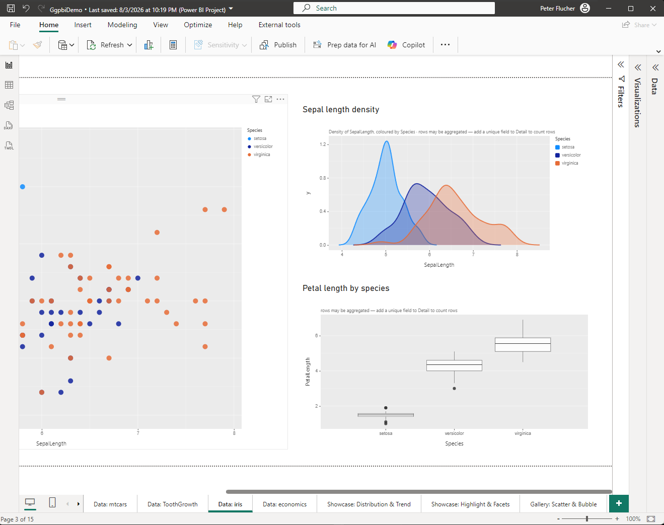
Three ggpbi visuals in one report, on the iris data set: scatter
plot, density curves per species, box plots. Cross-filtering and
tooltips like any built-in visual — no R, no Python, no
runtime.
A report like this is built by dropping fields into wells; the
Format Pane writes the ggpbi chain from them. And the
other way round: since version 0.5 the code view is a real
editor, with an optional vim mode. What you change there writes
back into the Format Pane — editor and pane are two doors
into the same room. The editor speaks three languages: the ggpbi
chain, ggplot2 in R, and ggpbir, the report’s JSON format.
And outside Power BI
ggpbi is an ES module with D3 underneath — Power BI is one
of the places it runs, not the only one. Both charts on
this page are drawn with it: the hours
up in the skills section and the
book matrix. And really with it
— the code below is exactly what draws them, not a simplified
example. The library loads only after the page is up; until
then a static SVG stands in — and stays put if anything goes
wrong.
Two charts, the same chain. ggpbi drops empty labels —
which is why only the fifteen most important books carry a
title, and repel pushes them apart until none
covers another.
What’s in it
Geoms: point, line, bar, col, area, text, boxplot,
violin, histogram, density, smooth (lm, loess, moving average),
segment, pointrange, plus the reference lines hline, vline and
abline.
Grammar: aesthetics (x, y, color, fill, size,
shape, alpha, group, label), positions (identity, stack, dodge,
fill, jitter), scales (linear, log, sqrt, time, category) with
locale-aware number and date formats, faceting by row and column,
and gghighlight-style highlighting.
Power BI native: cross-filtering by click,
native tooltips, context menu, report themes, high-contrast mode
and style presets.
Two fields are enough to start: one in X, one in Y. ggpbi picks the
geom from the scale types — number and number give a scatter
plot, category and number a bar chart, date and number a line, a
number on its own a histogram.
Status: version 0.5.0 — about 16,000 lines of TypeScript
across 51 modules, 67 test files. Not on AppSource yet; it installs
by file import in Power BI Desktop.
I ported the same core — scales, axes, label engine —
to Elm, to see what survives of the grammar when the compiler
flags every gap. The chart above is the TypeScript version.